MUHAI Visual Identity
Paola Fortuna, Studio +fortuna
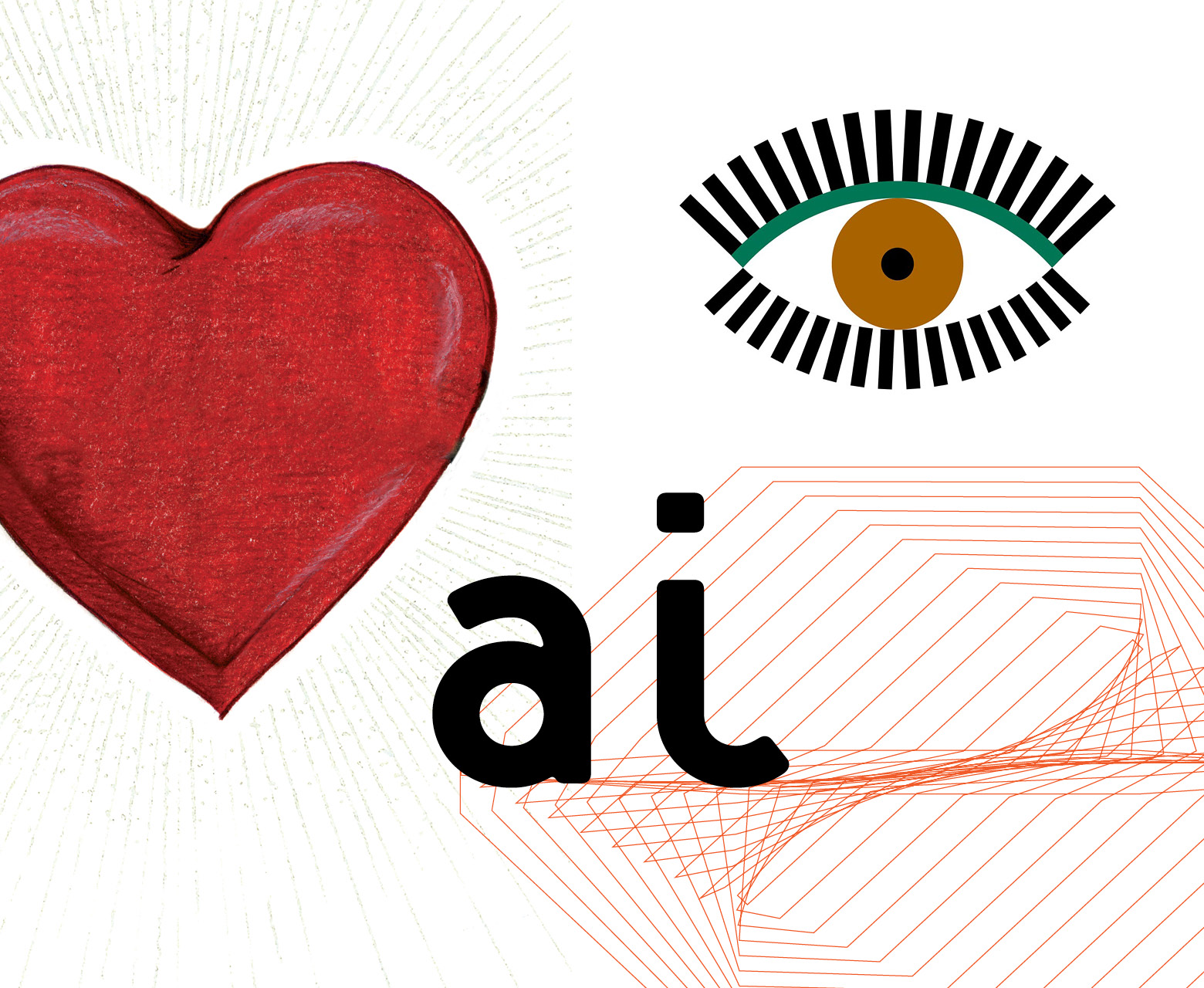
If the term “scientific” usually attracts our attention, the term “artificial” often alerts us, making us think of a world where human beings are at the margin and robots at the center.
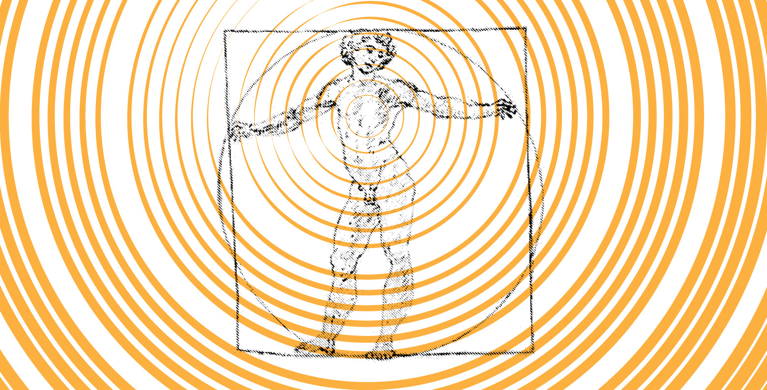
In MUHAI we try to reverse this approach, starting by interacting with the term “artificial” in a different way. We do this visually, on the basis of a key concept of the project: “Breaking through the barrier of meaning” (Luc Steels, 2020). This vision goes straight to the part of our brain that thinks in images, by receiving images and returning images. In order to activate it we must explore what is underneath the surface of things and try and catch the idea we are trying to communicate, in its primary essence, Images reach the brain before words do.
Keys are needed to activate this area. We attempt to isolate some meaningful words in the in the texts produced for this project. Some keywords are therefore identified: human-centric / meaning / understanding / AI / language / research / process / dynamic memory / storytelling / creativity / relationship / abstraction / trustworthiness.
These concepts take us away from the cliché of a typical dystopian sci-fi picture of machines dominating human beings. Rather, they lead us to imagine an artificial intelligence that can help us improve our personal and social lives.
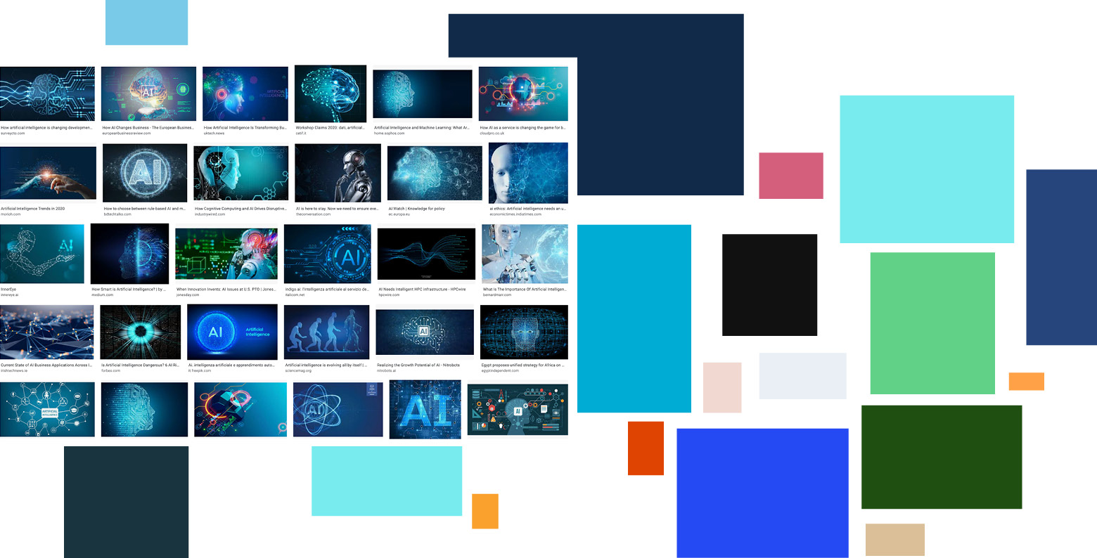
“Artificial Intelligence” on the internet, in its visual form, is blue, glacial. To “break through the barrier of meaning” we need to reduce the distance, by warming everything up with colors that welcome us and make us feel comfortable. We have to explore other colors, maybe warm and welcoming colors. We have to break through the barriers between colors, play with shades, so to make a color turn into another one seamlessly.
Once the colors have changed, the borders between them are erased, we then look at the words that make up the acronym MUHAI: Meaning / Understanding / Human-centric / Artificial / Intelligence.
MUHAI: Five letters, with an H at the center. The Human element is at the center of the project and becomes the center of its visualization as well. Just like a human being, the H begins to move on its own, upsets the balance of the word, and pulsates as a heart, transmitting passion and empathy. It also blinks like a watching eye, that looks at Artificial Intelligence in a new light.
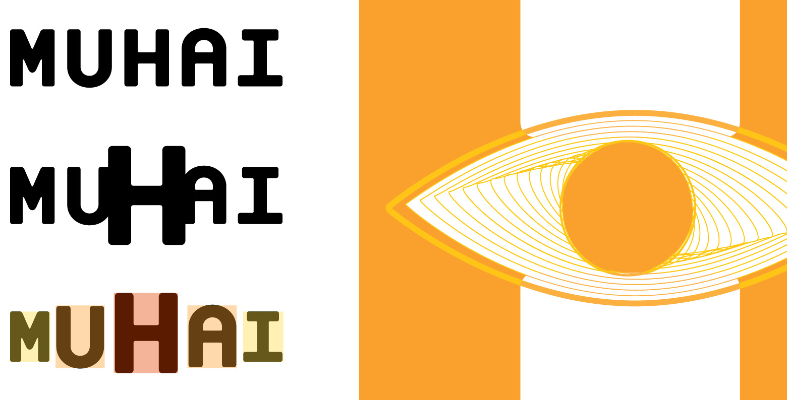
To keep this pulsation imprinted even in a static subject, we pick a fragment of the movement that transmits the idea of flowing. And we remove the last hints of rigidity by rounding the edges of the
typeface.
To make this happen, we had to move away from the surface of things, in the urgency of conveying a new AI, where the Human is central also in its visualization.

More Articles
Uncommon Ground
Do you speak AI?

Pragmatics: the secret ingredient

Deconstructing Recipes
Foundations for Meaning and Understanding in Human-centric AI

The FCG Editor: a new milestone for linguistics and human-centric AI

Linguistic Alignment for Chatbots

Framing reality
